Digital Account Application
Designed by Alphie Chen
Directed by Nima H.K.
Type: UX/UI Design
Directed by Nima H.K.
Type: UX/UI Design
Founded in 1985, First Republic Bank was a commercial
bank and provider of wealth management services
headquartered in San Francisco.
“It's a privilege to serve you” is the apropos tagline for
First Republic Bank, as they're known for exceeding
expectations and serving clients in unexpected ways.
The existing First Republic’s digital account application
flow had several problems that resulted in a high drop-off
rate. As a result, the entire flow needed to be redesigned
to address these problems, making it more user-friendly
and easier for clients to open an account online, ultimately
reducing the drop-off rate.
As a product designer at First Republic, my role was
to redesign the digital account application. This page
highlights three major redesigns I worked on: account
type selection, the progress indicator, and address
validation.
Additionally, it showcases the reusable components
we added to the design system for consistency across
other banking products.
bank and provider of wealth management services
headquartered in San Francisco.
“It's a privilege to serve you” is the apropos tagline for
First Republic Bank, as they're known for exceeding
expectations and serving clients in unexpected ways.
Project Overview
The existing First Republic’s digital account application
flow had several problems that resulted in a high drop-off
rate. As a result, the entire flow needed to be redesigned
to address these problems, making it more user-friendly
and easier for clients to open an account online, ultimately
reducing the drop-off rate.
My Role
As a product designer at First Republic, my role was
to redesign the digital account application. This page
highlights three major redesigns I worked on: account
type selection, the progress indicator, and address
validation.
Additionally, it showcases the reusable components
we added to the design system for consistency across
other banking products.
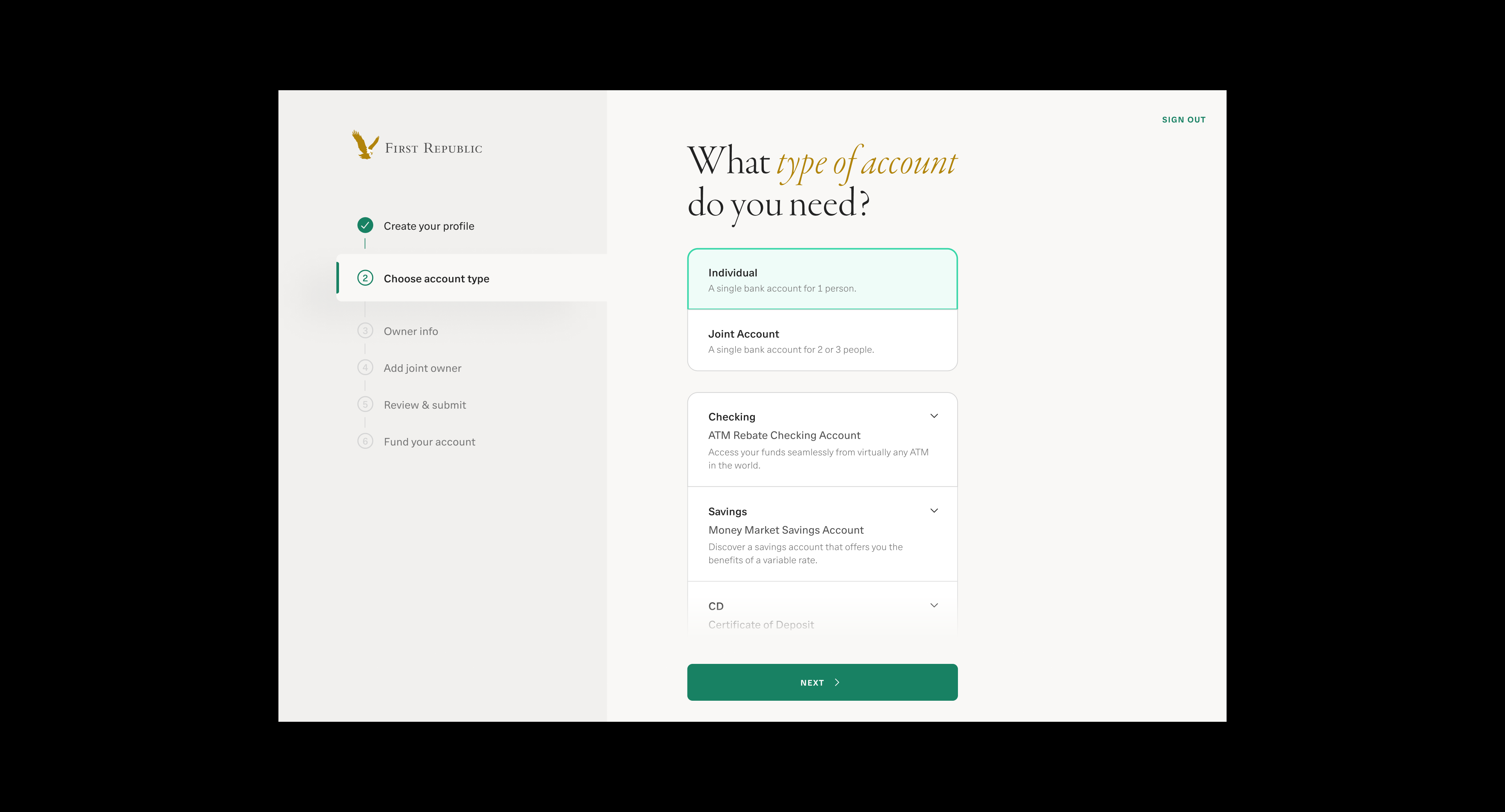
Account Type Selection
Problem
Problem
Data from bankers and the product manager shows a
huge drop-off rate on the Select Account Type page,
caused by confusing account names, poorly organized
information, unhelpful illustrations, and CTA buttons
that are easy to miss.
Goal
1. Simplify Account Selection:
Make account types easy to understand and clearly
indicate from the start that both individual and joint
accounts are available for the three account types:
Checking, Savings, and CD.
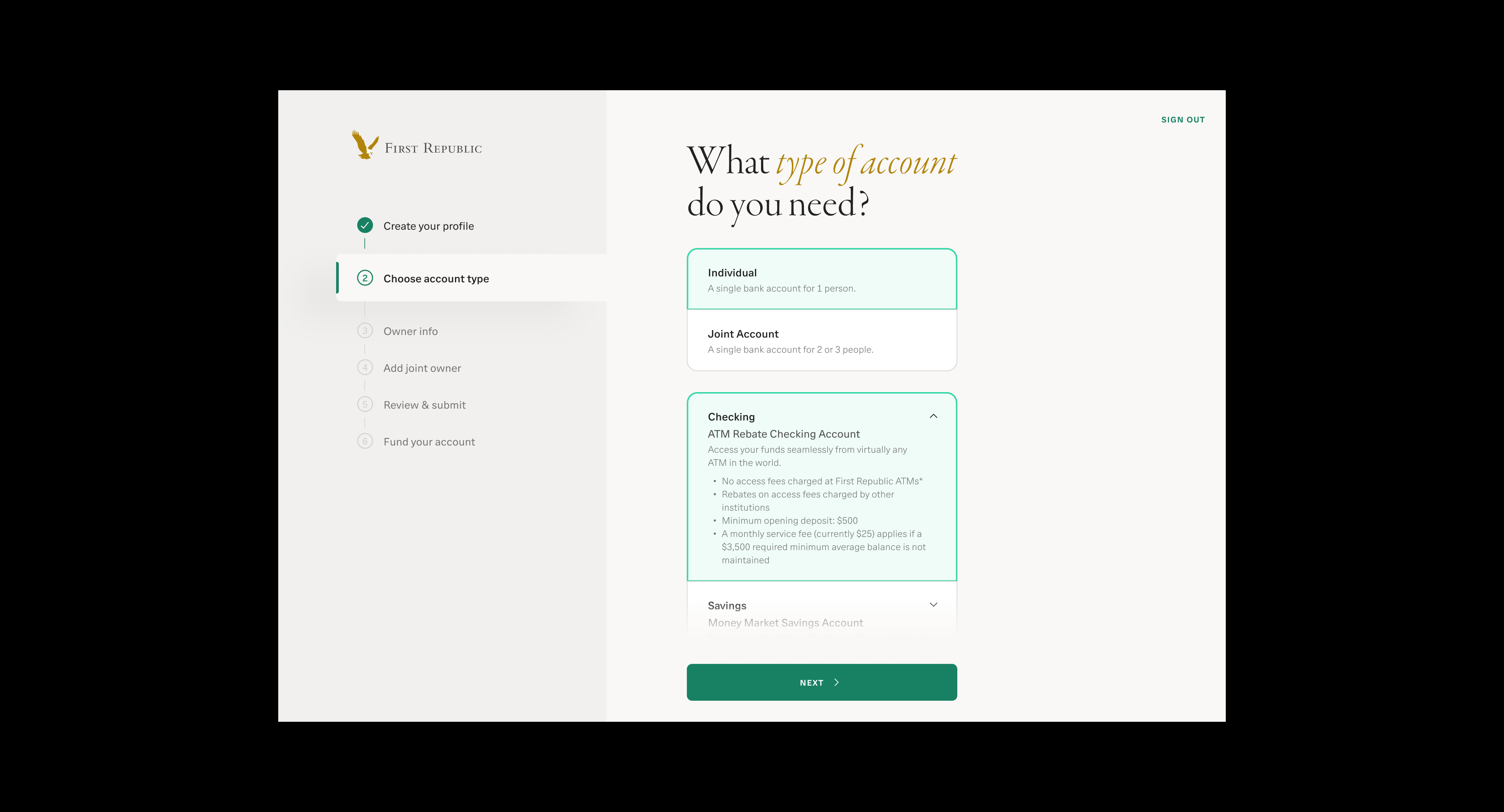
2. Organize Information Clearly:
Structure content so applicants can scan and
compare account types quickly.
3. Improve CTA Visibility:
Make the CTA buttons more prominent and easy
to find.
4. Reduce Drop-Off Rate:
Encourage more users to complete the Select
Account Type step successfully.
Solution
In the redesign, applicants first choose whether they
want to open an individual or joint account, and then
select the type of account they are interested in.
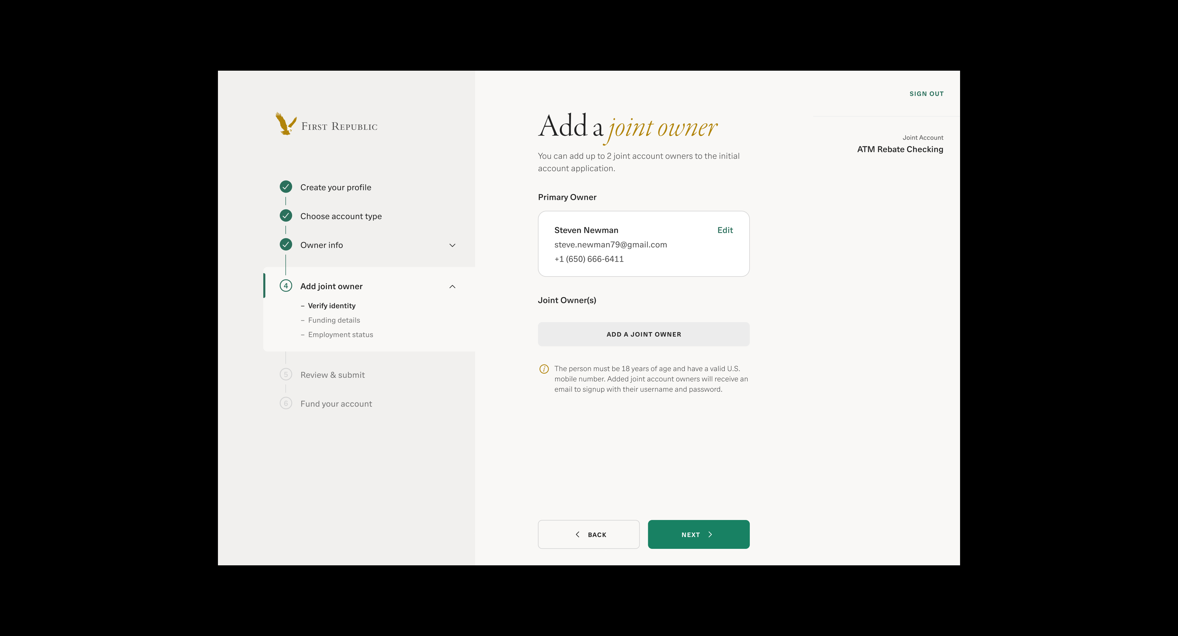
If applicants select an individual account, an additional
step called "Add Joint Owner" will appear in the
progress indicator. This gives them the flexibility
to add one or two joint owners later if they change
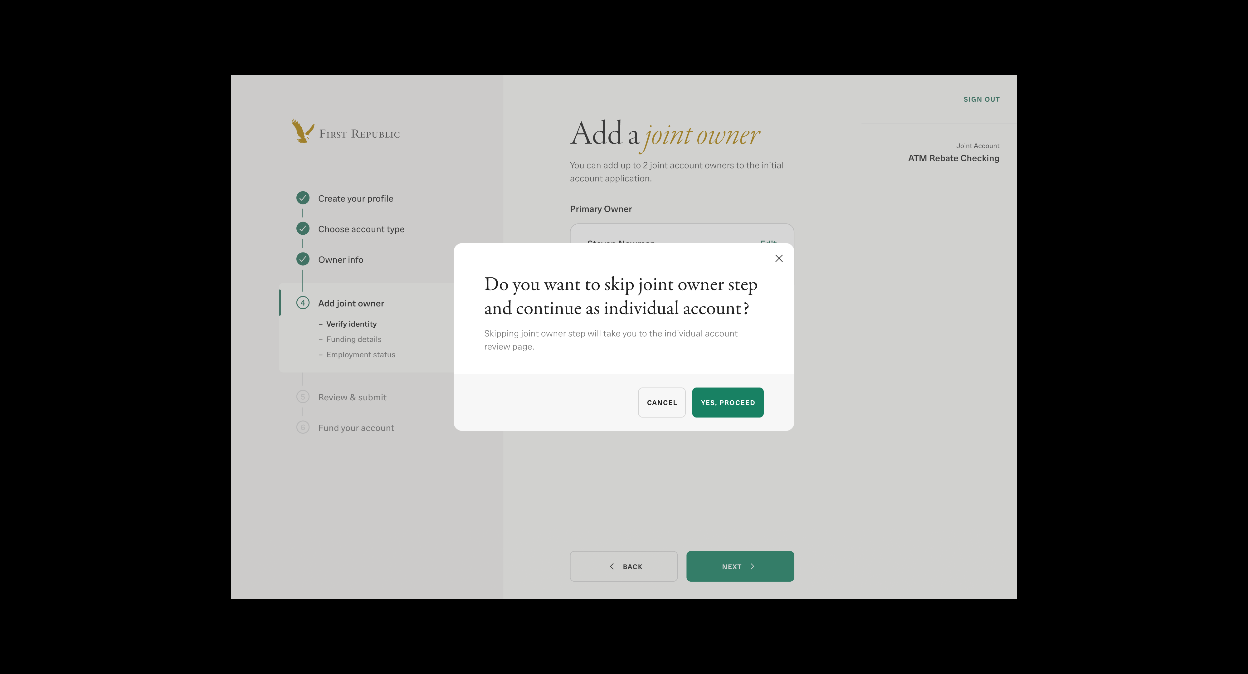
their mind. If they choose to skip the joint owner
step, a pop-up will appear to confirm their decision.
If applicants select an individual account, an additional
step called "Add Joint Owner" will appear in the
progress indicator. This gives them the flexibility
to add one or two joint owners later if they change
their mind. If they choose to skip the joint owner
step, a pop-up will appear to confirm their decision.
step called "Add Joint Owner" will appear in the
progress indicator. This gives them the flexibility
to add one or two joint owners later if they change
their mind. If they choose to skip the joint owner
step, a pop-up will appear to confirm their decision.
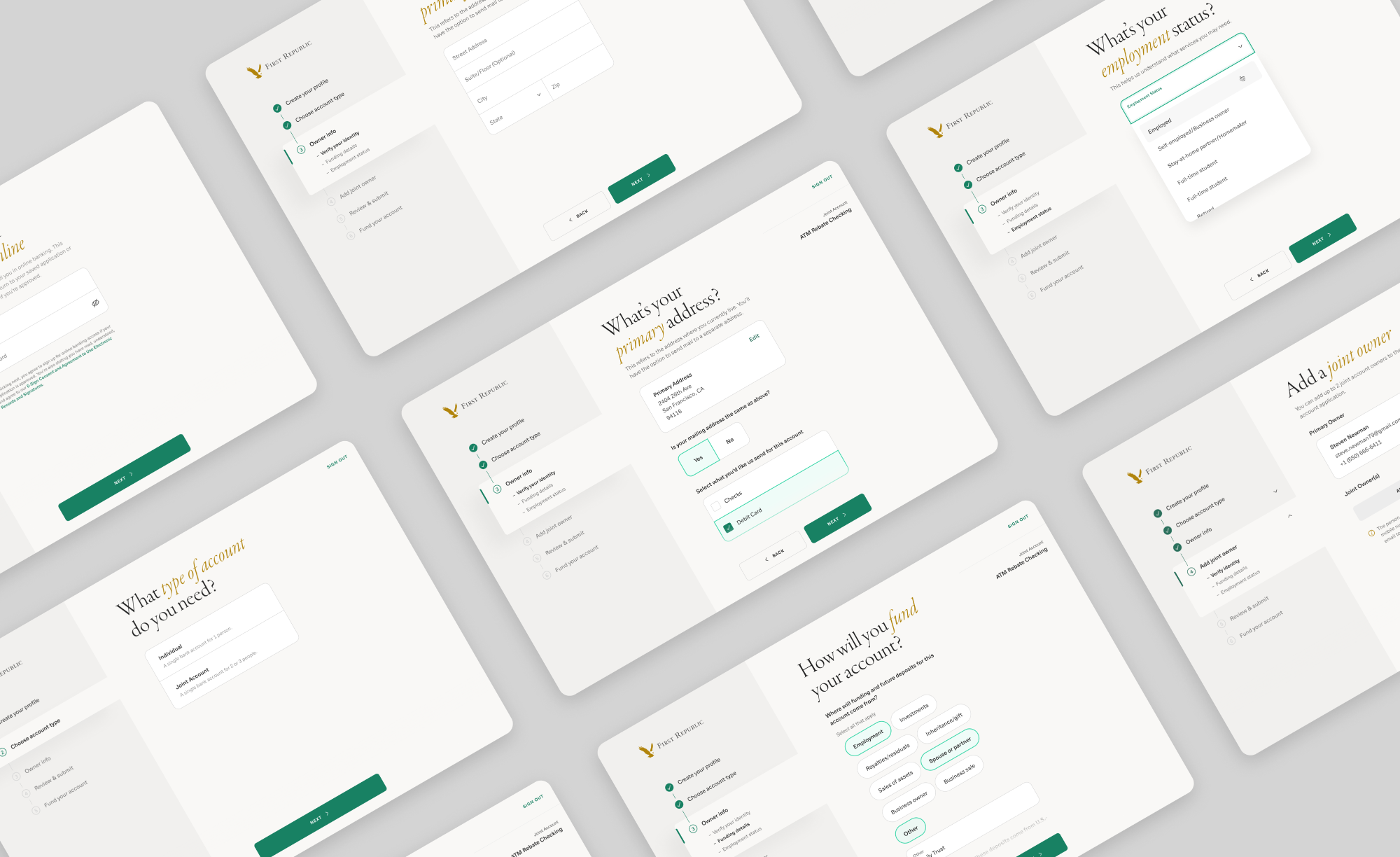
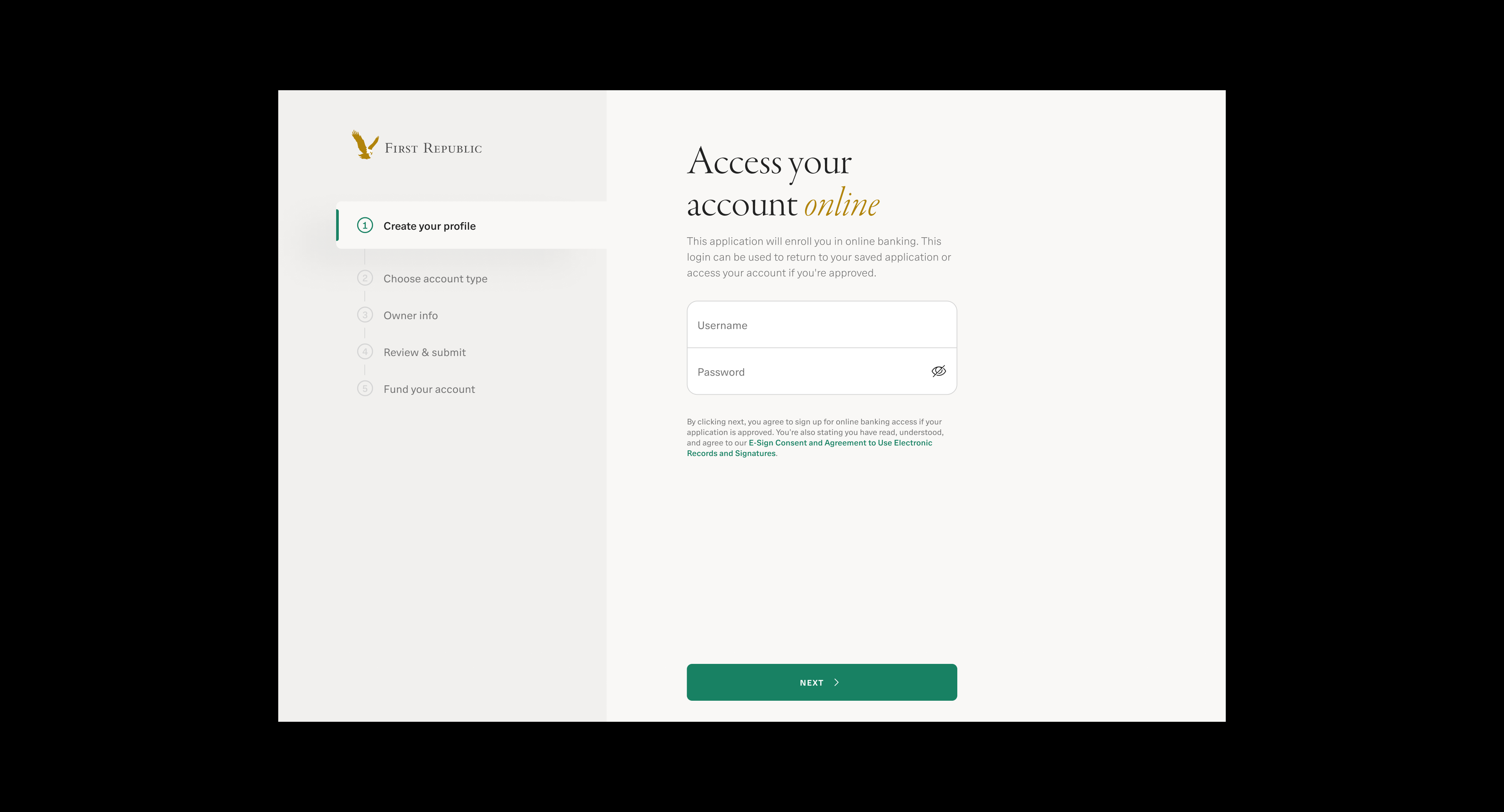
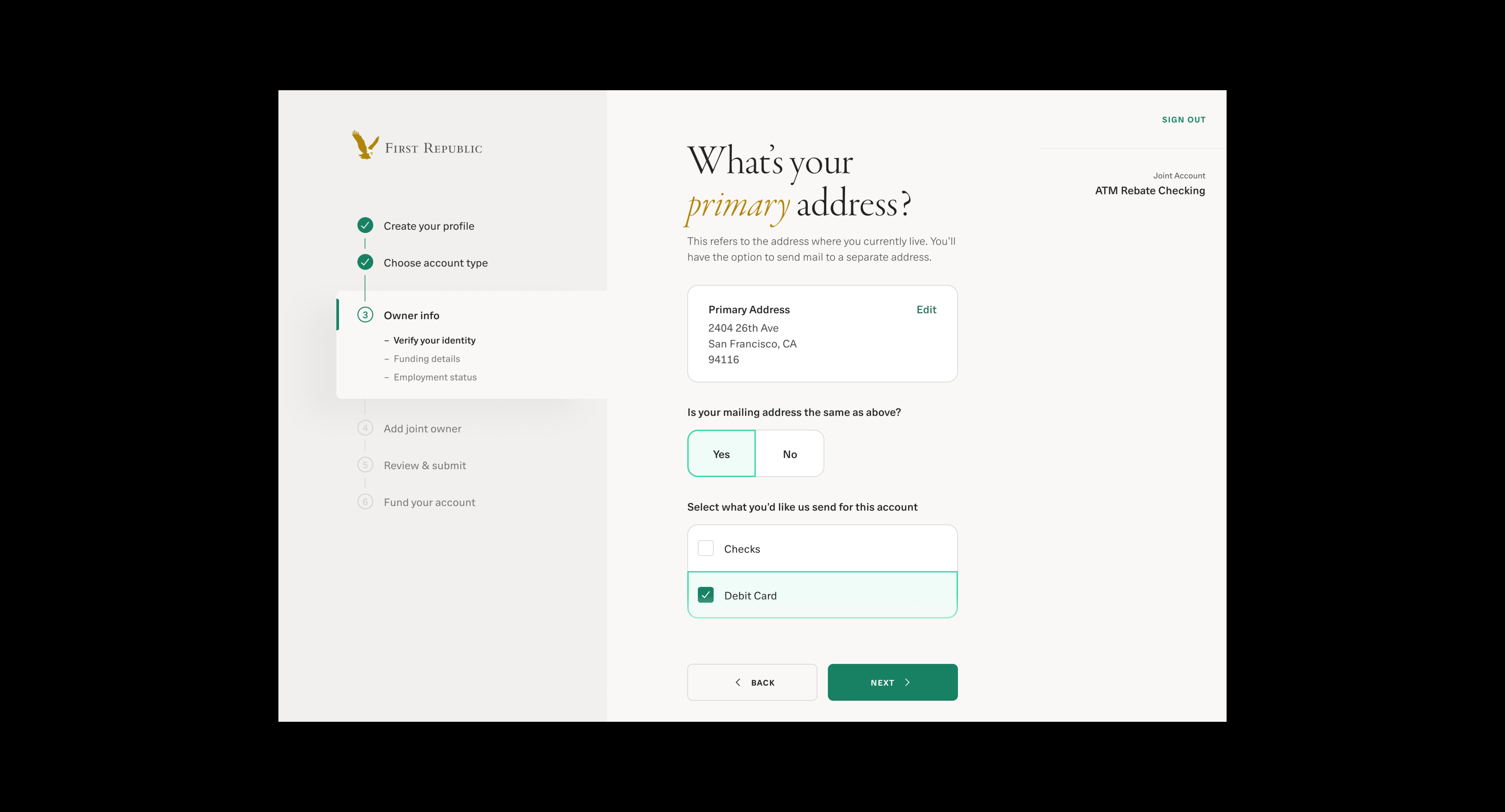
Progress Indicator
Problem
Problem
The existing digital account application flow has a high
drop-off rate due to long-scrolling pages and the absence
of a progress indicator. Without well-structured content
and visibility into their current step and remaining steps,
applicants often become impatient and abandon the
process before completion.

Goal
-
Clear Progress Indication:
Show applicants which step they’re on and how many
steps remain. - Simplify Page Content:
Break up long pages and reduce information overload.
-
Streamline the Flow:
Guide users to move through the application confidently
without feeling lost or overwhelmed. -
Reduce Drop-Off Rate:
Encourage more users to complete the application by
making the process clearer and easier to follow.
-
Clear Progress Indication:
Show applicants which step they’re on and how many
steps remain. - Simplify Page Content:
Break up long pages and reduce information overload.
-
Streamline the Flow:
Guide users to move through the application confidently
without feeling lost or overwhelmed. -
Reduce Drop-Off Rate:
Encourage more users to complete the application by
making the process clearer and easier to follow.
Solution
Introduce a progress indicator and break down the flow
into 6 steps: Create your profile, Choose account type,
Owner info,
Review & submit, and Fund your account.
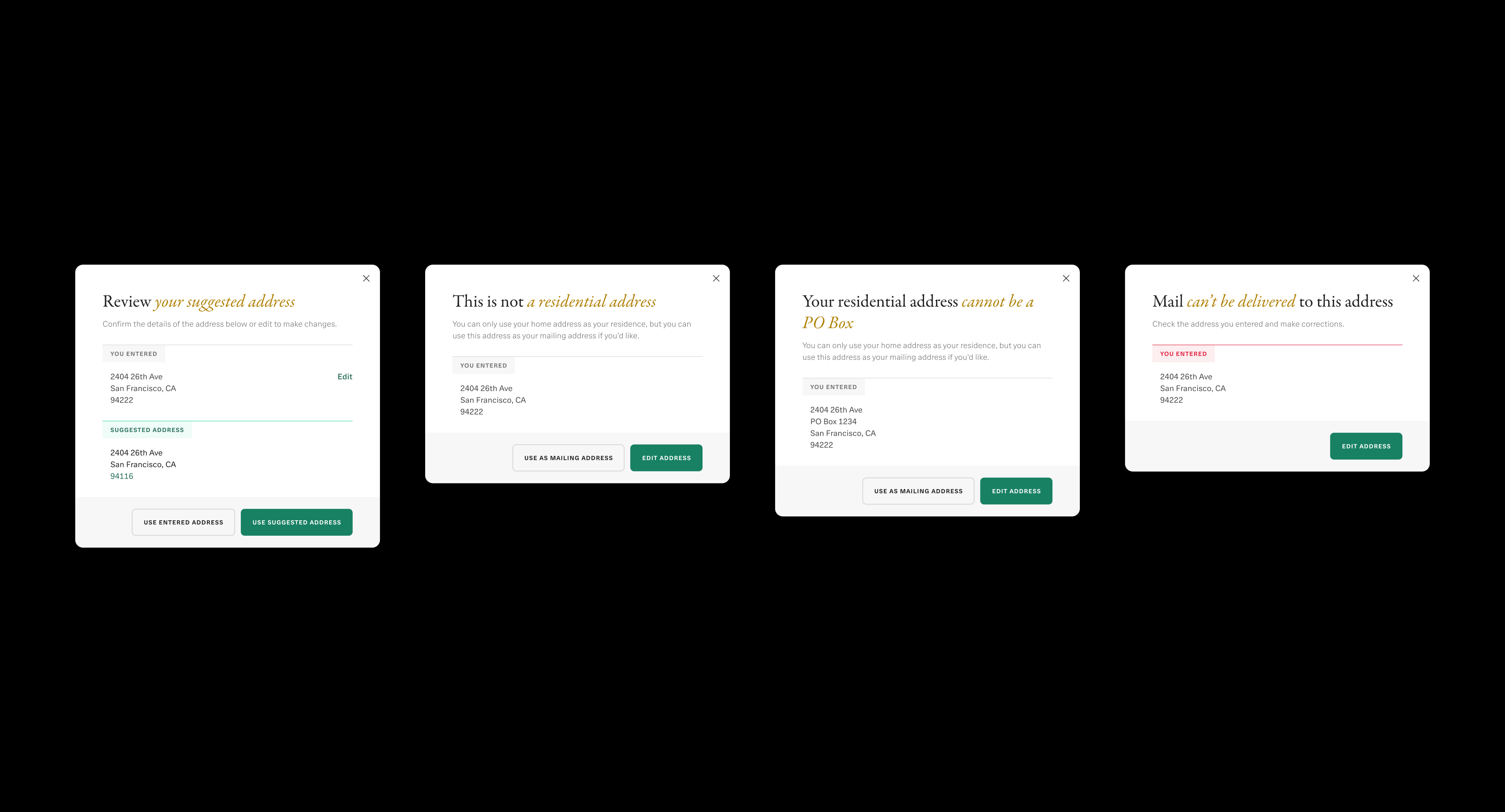
Address Validation
Problem
The lack of address validation and unclear copy led to
invalid addresses for mailing or legal purposes, reduced
address match strength, and negatively impacted risk
scoring for external funding transactions. As a result,
bankers had to reach out to applicants to collect the correct
addresses, which increased back-and-forth communication
and their workload.

Goals
- Ensure Address Accuracy:
Prevent invalid, incomplete, or undeliverable addresses
to comply with bank mailing and legal requirements.
- Improve Risk Scoring:
Increase the probability of accurate matches within the
funding risk model.
- Enhance User Experience:
Provide clear copy and guidance so applicants can
confidently enter their addresses.
- Reduce Banker Workload:
Minimize the need for bankers to contact applicants to
correct address errors.
Prevent invalid, incomplete, or undeliverable addresses
to comply with bank mailing and legal requirements.
Increase the probability of accurate matches within the
funding risk model.
Provide clear copy and guidance so applicants can
confidently enter their addresses.
Minimize the need for bankers to contact applicants to
correct address errors.
Solution
Validate addresses in real time with contextual pop-ups for
5 scenarios to prevent errors and ensure compliance with
bank mailing and legal requirements.
Validate addresses in real time with contextual pop-ups for
5 scenarios to prevent errors and ensure compliance with
bank mailing and legal requirements.

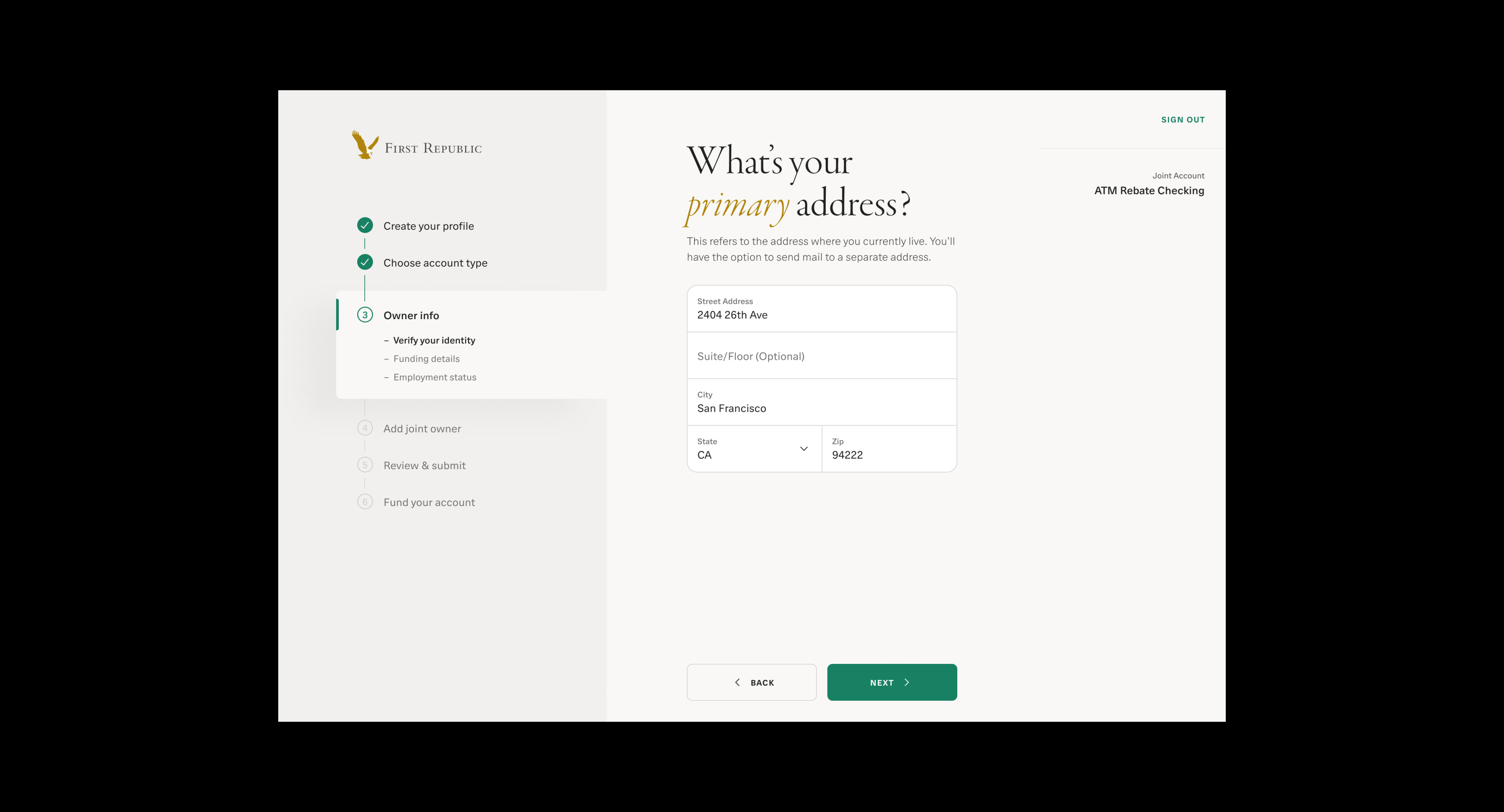

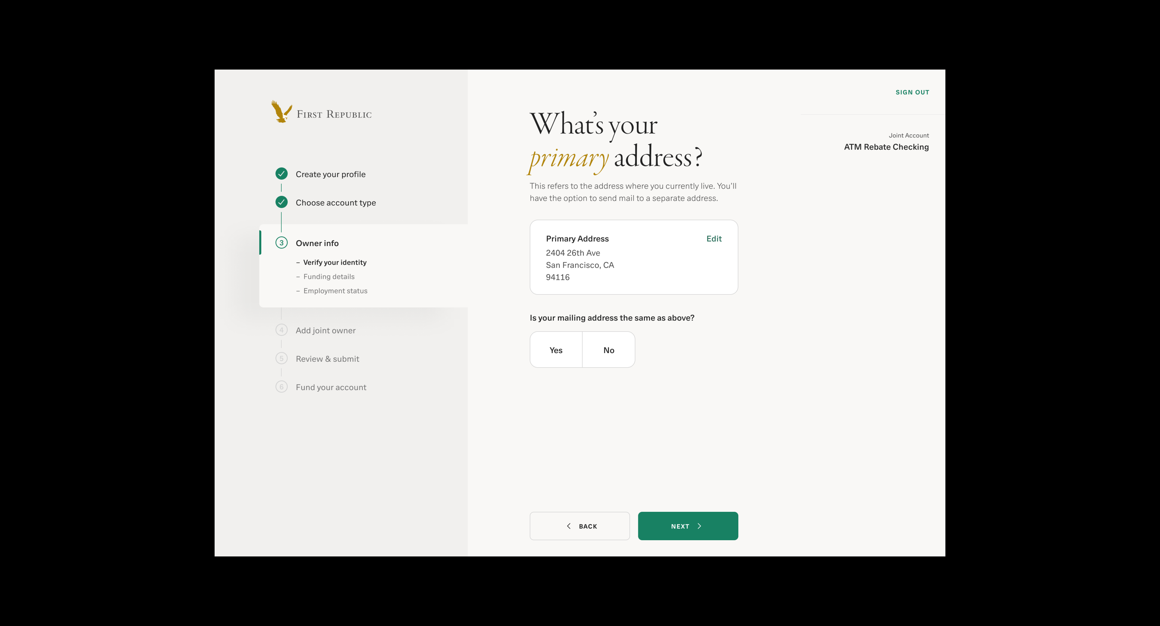
Use Cases
- Happy Path:
If the address is correct, the applicant can proceed
smoothly to the next step. - Suggested Address:
If the address contains a typo or incorrect ZIP code,
a pop-up suggests a USPS validated address. - Non-Residential Address:
If the address is a business address, a pop-up warns that
only a home address can be used as the primary address,
but the applicant can use it as the mailing address. - PO Box Address:
If the address is a PO Box address, a pop-up warns that
only a home address can be used as the primary address,
but the applicant can use it as the mailing address. - Undeliverable Address:
If the address is unknown, a pop-up warns that mail
cannot be delivered.
If the address is correct, the applicant can proceed
smoothly to the next step.
If the address contains a typo or incorrect ZIP code,
a pop-up suggests a USPS validated address.
If the address is a business address, a pop-up warns that
only a home address can be used as the primary address,
but the applicant can use it as the mailing address.
If the address is a PO Box address, a pop-up warns that
only a home address can be used as the primary address,
but the applicant can use it as the mailing address.
If the address is unknown, a pop-up warns that mail
cannot be delivered.
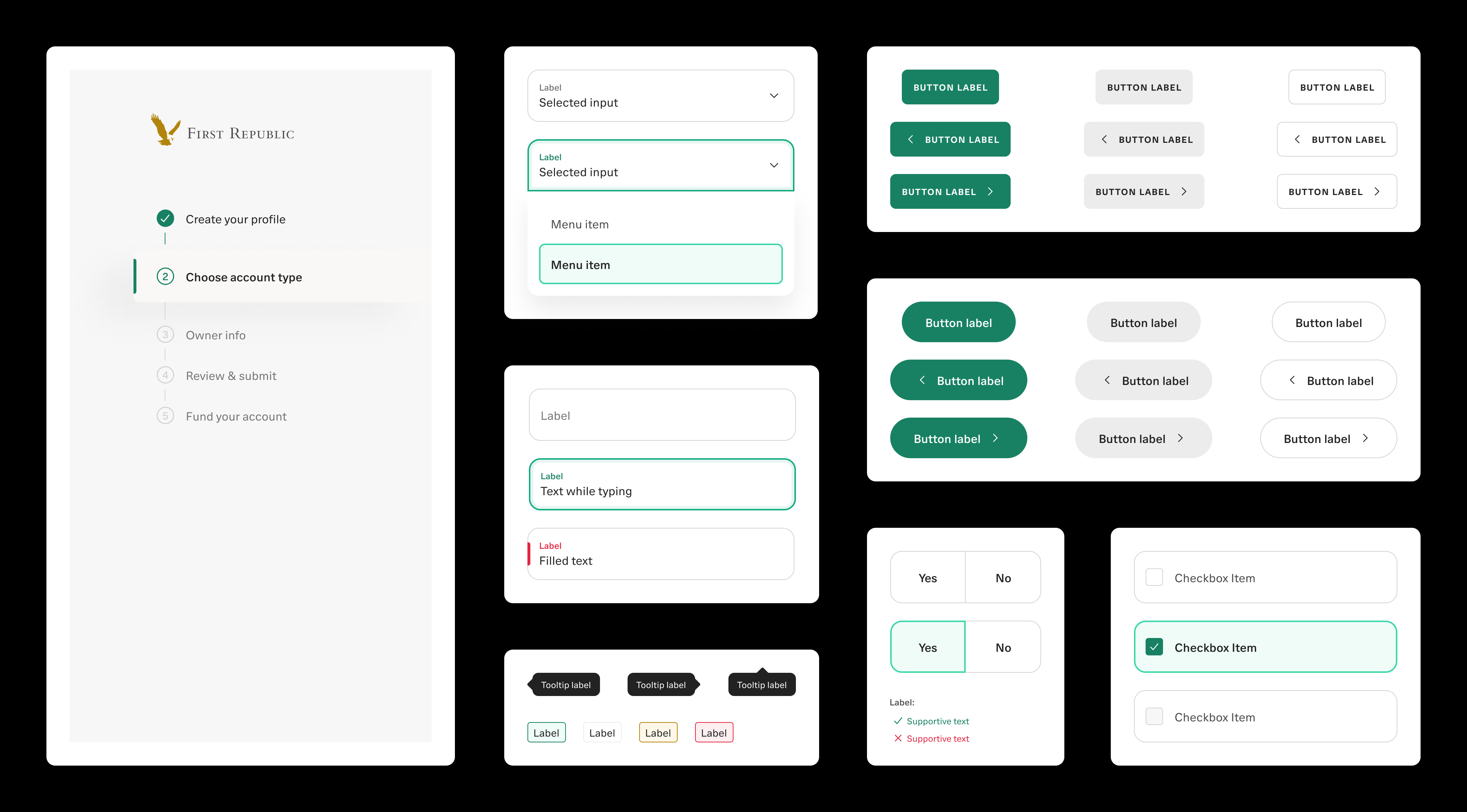
Reusable Components
Beyond redesigning the application, we focused on long-term
scalability by contributing reusable components to the design
system that extend far beyond a single use case.
These components
allow the bank to launch new products faster and more efficiently.
This approach optimized our internal workflow and reduced
development time by 50%.
Beyond redesigning the application, we focused on long-term
scalability by contributing reusable components to the design
system that extend far beyond a single use case. These components
allow the bank to launch new products faster and more efficiently.
This approach optimized our internal workflow and reduced
development time by 50%.
scalability by contributing reusable components to the design
system that extend far beyond a single use case. These components
allow the bank to launch new products faster and more efficiently.
This approach optimized our internal workflow and reduced
development time by 50%.