Financial Priorities Game
Designed by Alphie Chen
Type: UX/UI Design
Type: UX/UI Design
Founded in 1985, First Republic Bank was a commercial
bank and provider of wealth management services
headquartered in San Francisco.
“It's a privilege to serve you” is the apropos tagline for
First Republic Bank, as they're known for exceeding
expectations and serving clients in unexpected ways.
bank and provider of wealth management services
headquartered in San Francisco.
“It's a privilege to serve you” is the apropos tagline for
First Republic Bank, as they're known for exceeding
expectations and serving clients in unexpected ways.
Project Overview
First Republic Bank believed in its clients' dreams
and goals. The Priorities Exploration tool originally
was a physical card game, designed for the selected
top-tier customers only to align their financial goals
with their values and create a comprehensive plan
tailored to their needs.
Since the pandemic began in 2020, many industries
have been forced to change how they operate.
First Republic had been dedicated to transforming
its exceptional walk-in service into seamless digital
experiences.
The Priorities Exploration tool was one of the key
projects the bank chose to digitalize, making it available
to all existing clients and new potential clients, not just
selected top-tier customers.
My Role
As the main Product Designer, my primary responsibility
was to translate the physical experience into a user-friendly
digital experience and design the user interface.
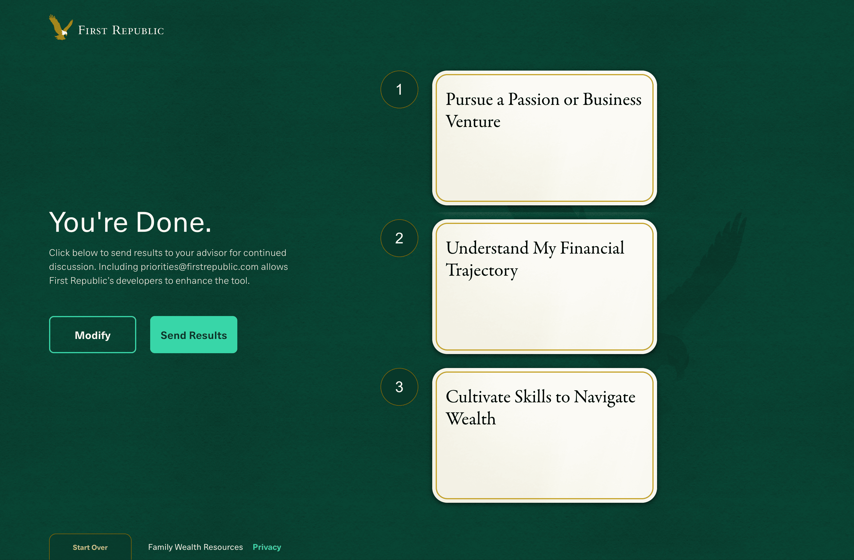
The Challenge
The key challenge was simplifying the flow and making
it fun and easy for users to use the tool, while also creating
a refreshed visual experience that remained aligned with
First Republic's look and feel.
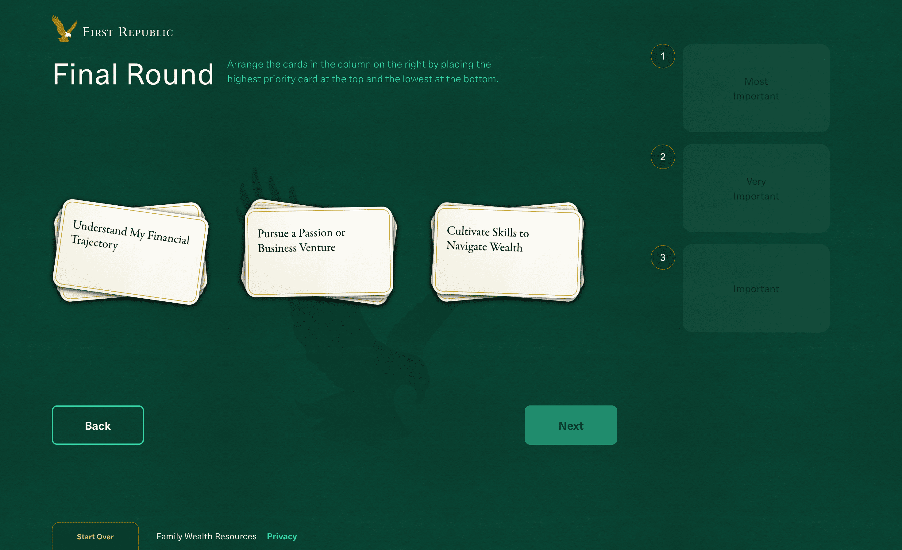
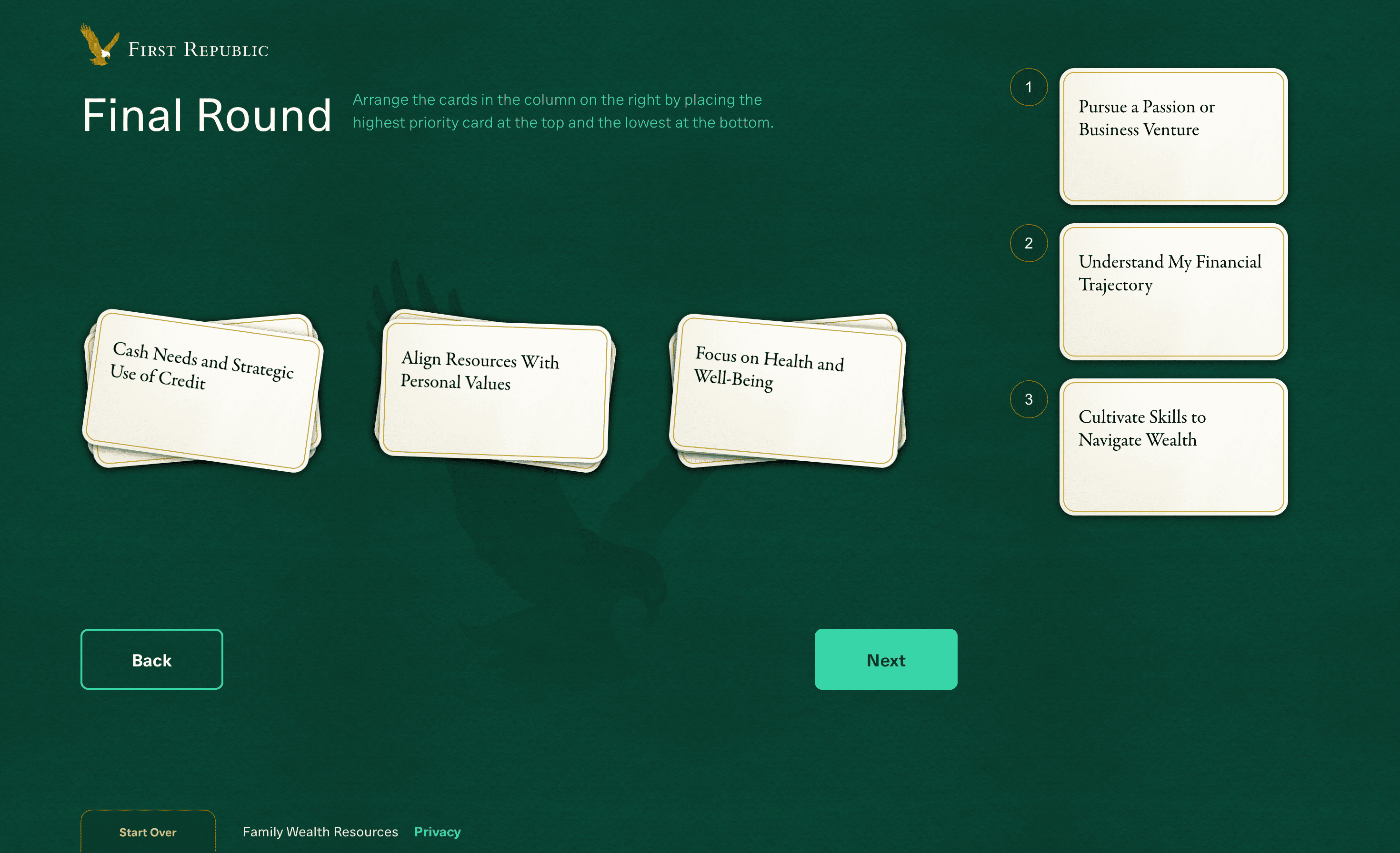
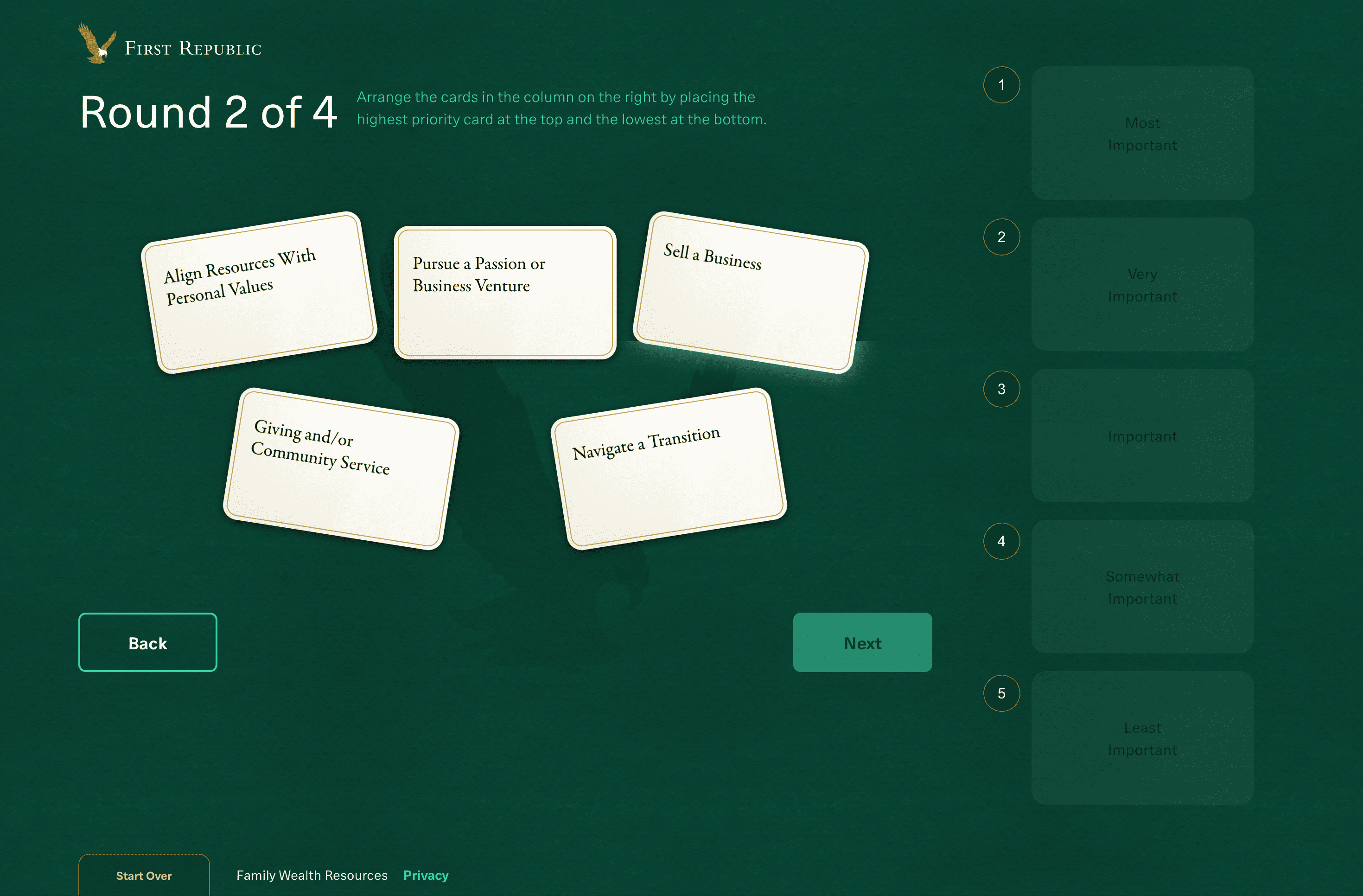
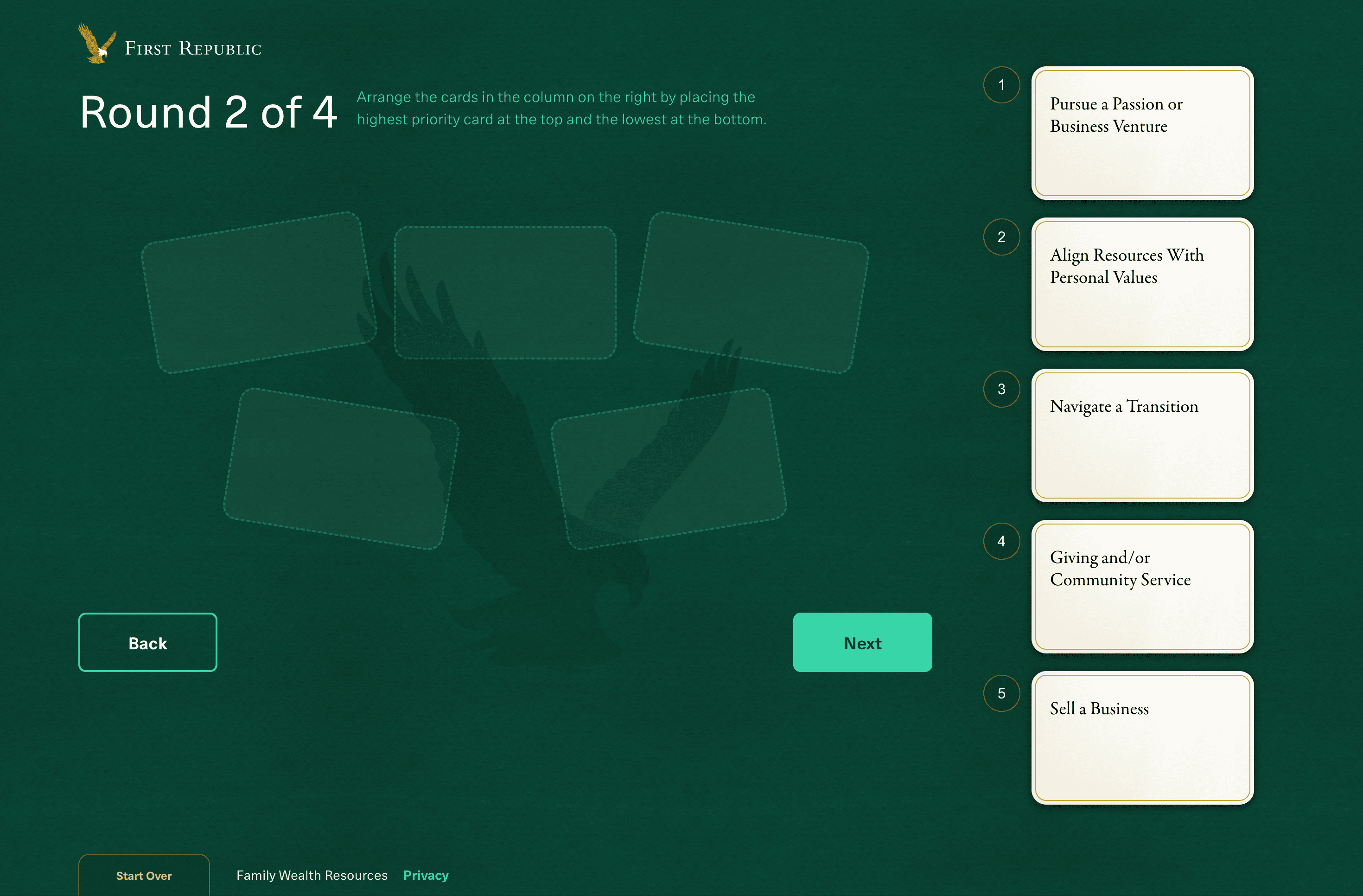
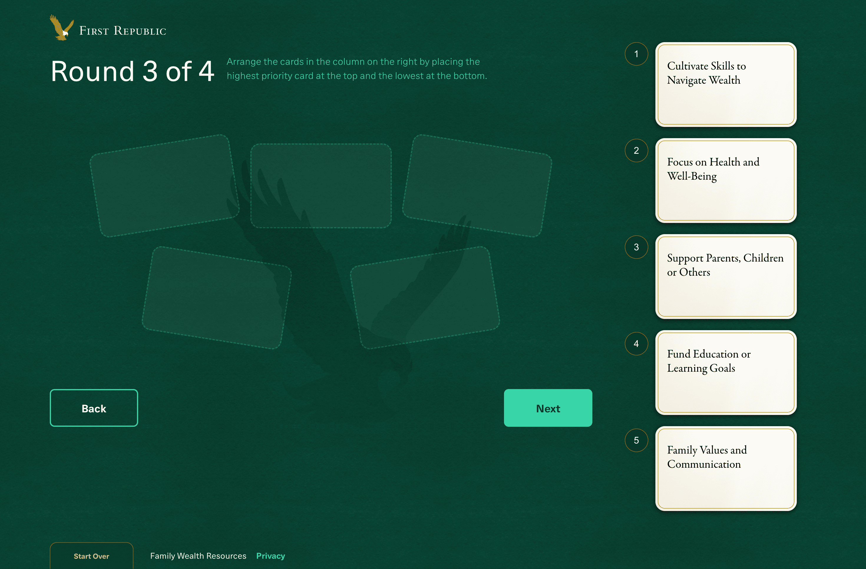
User Flow
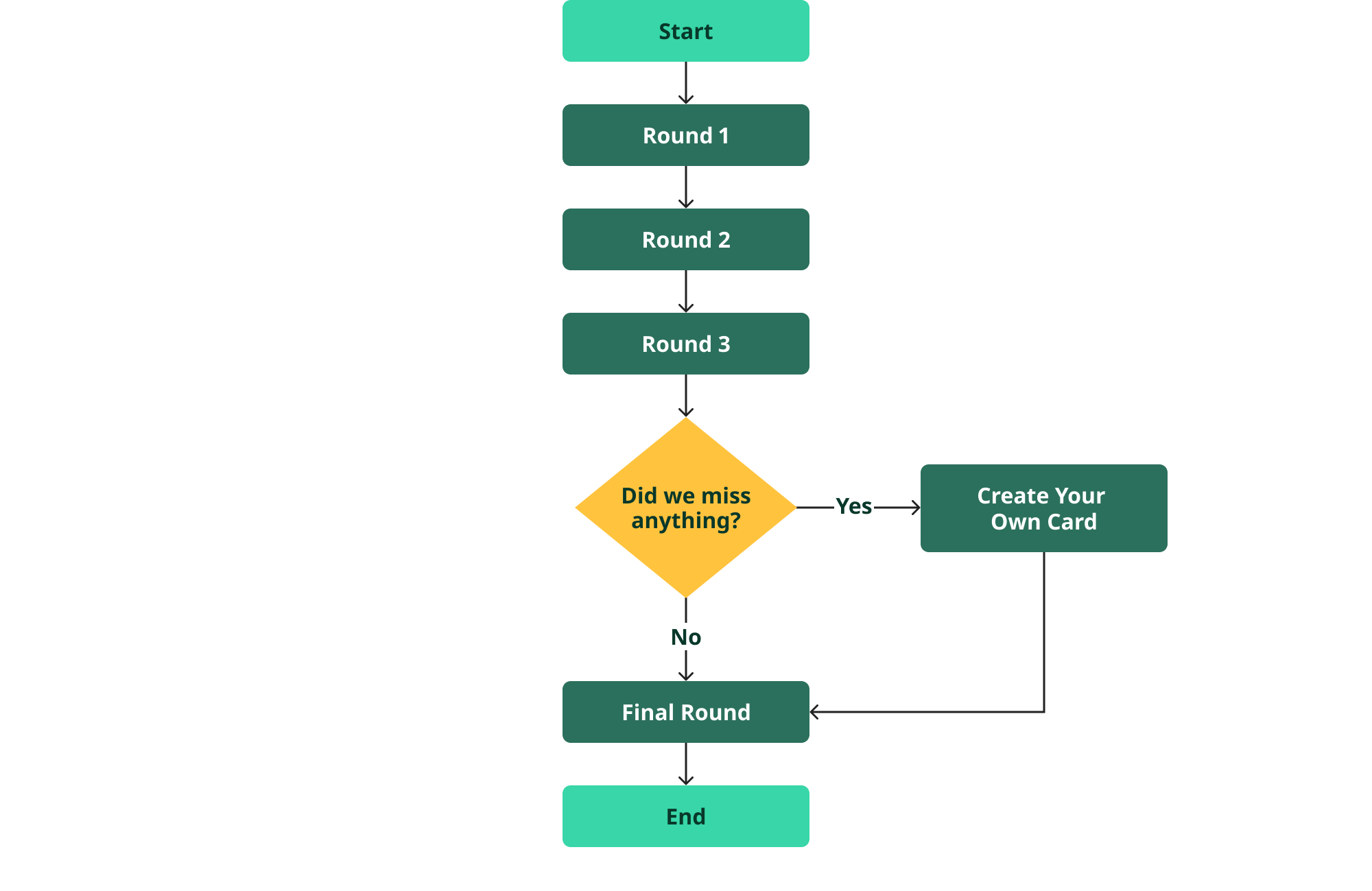
Cohesive Layout
A layout was created for Rounds 1 to 3 to ensure visual
consistency and a cohesive experience. This approach
helps users understand that when the cards are
scattered on the page, they should move them to the
column on the right and rank them from most
important to least important. Conversely, if they want
to return the cards, they can place them back within
the dashed outlined shapes.
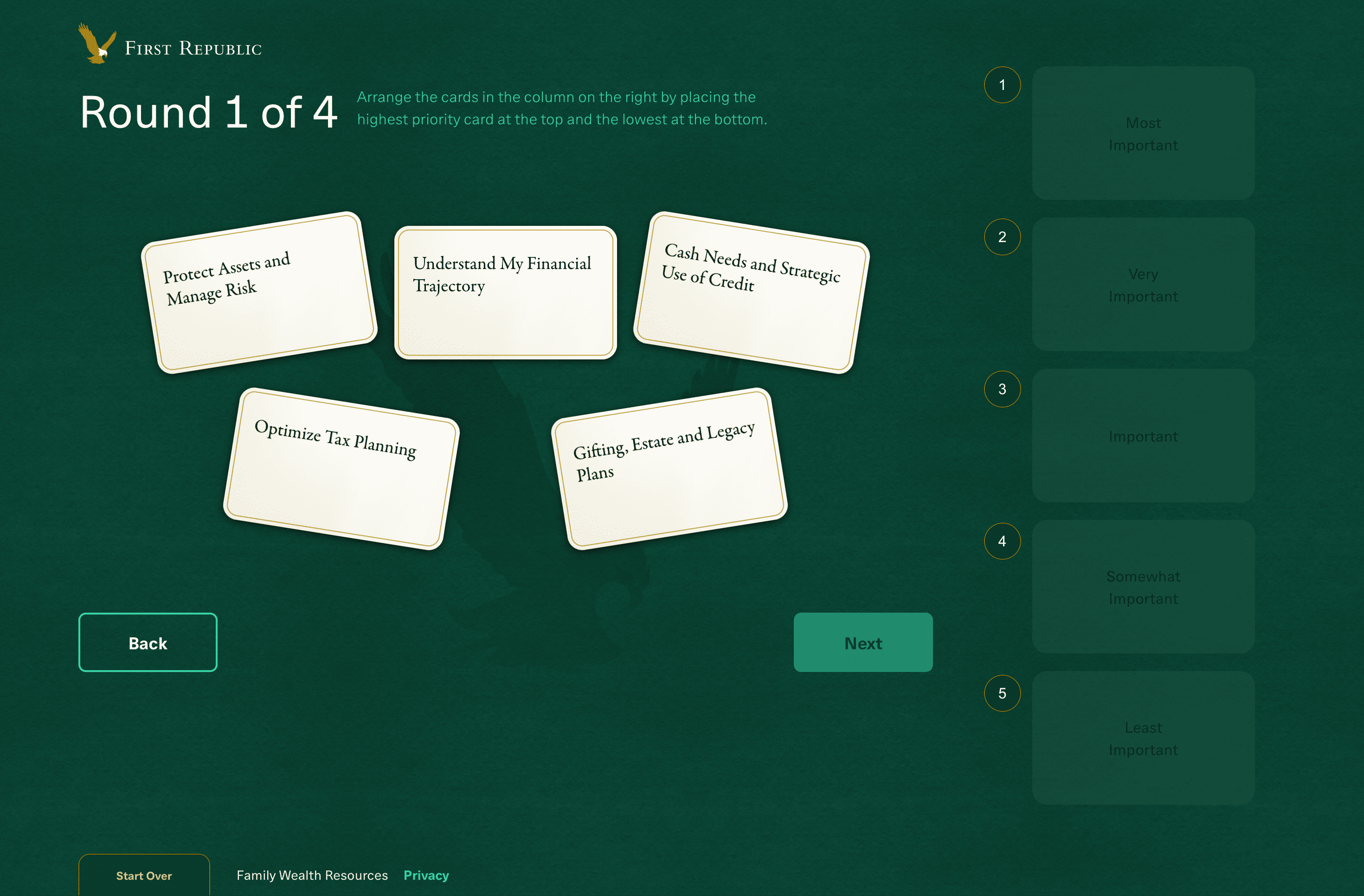
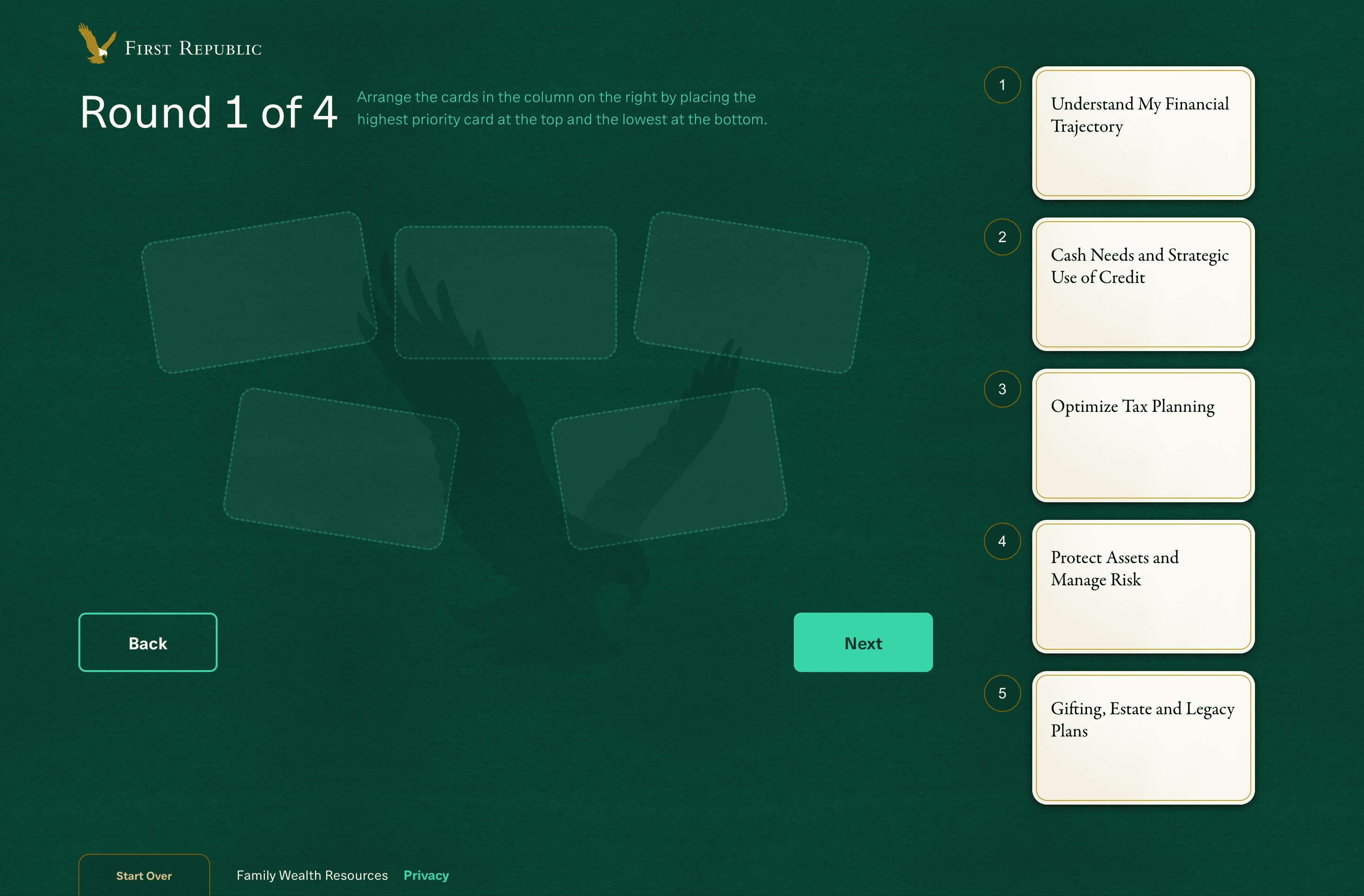

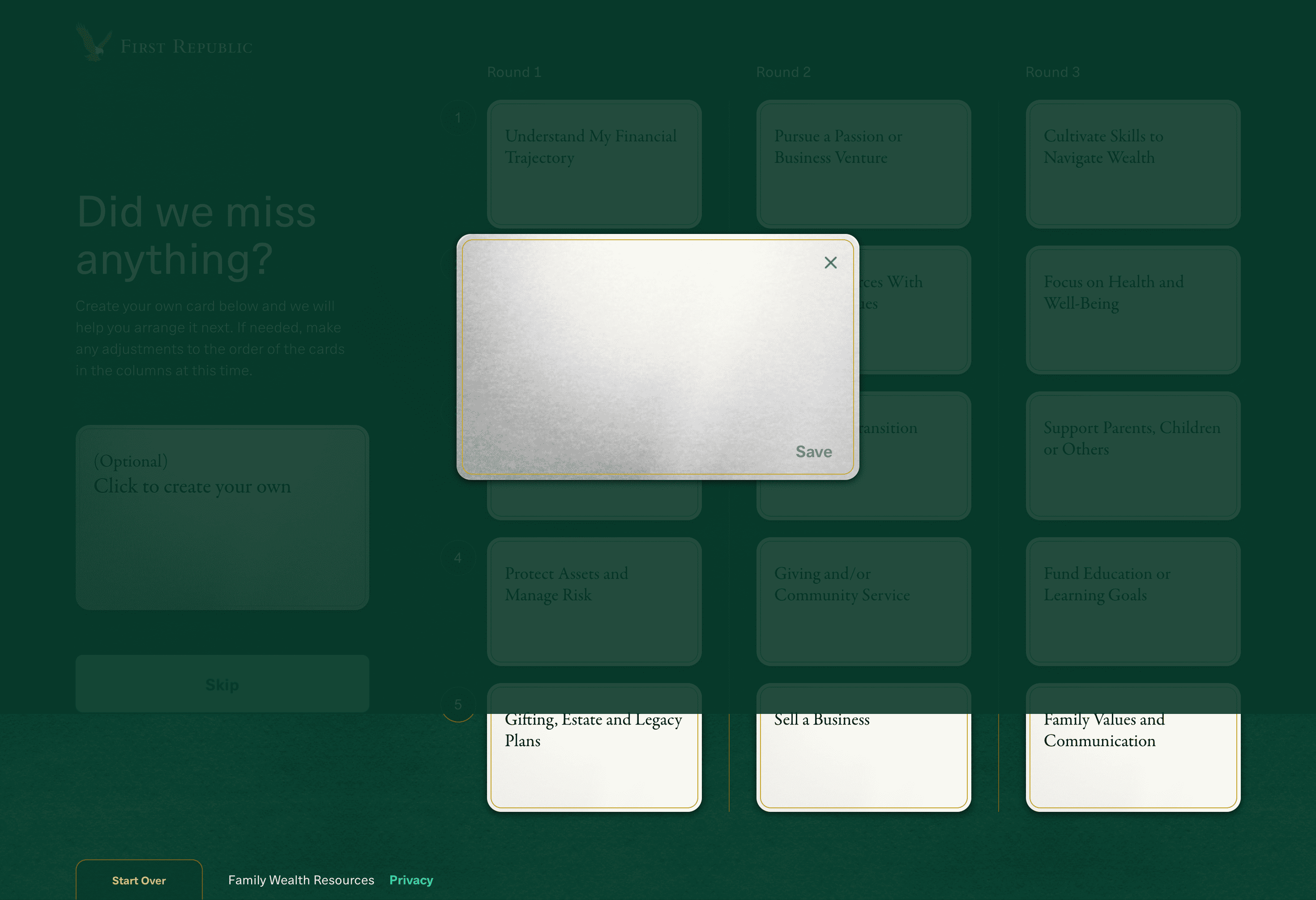
Color with Purpose
Before, the cards were put together in one package,
requiring four different colors to indicate which
round they belonged to. Since each round is now
a single page in the digital version, we reduced
the color palette to two: gold and platinum. All cards
are gold, except the optional wild card, which is
platinum. Gold is First Republic's accent color,
symbolizing value and importance, which ties directly
to customers' financial goals.
Before
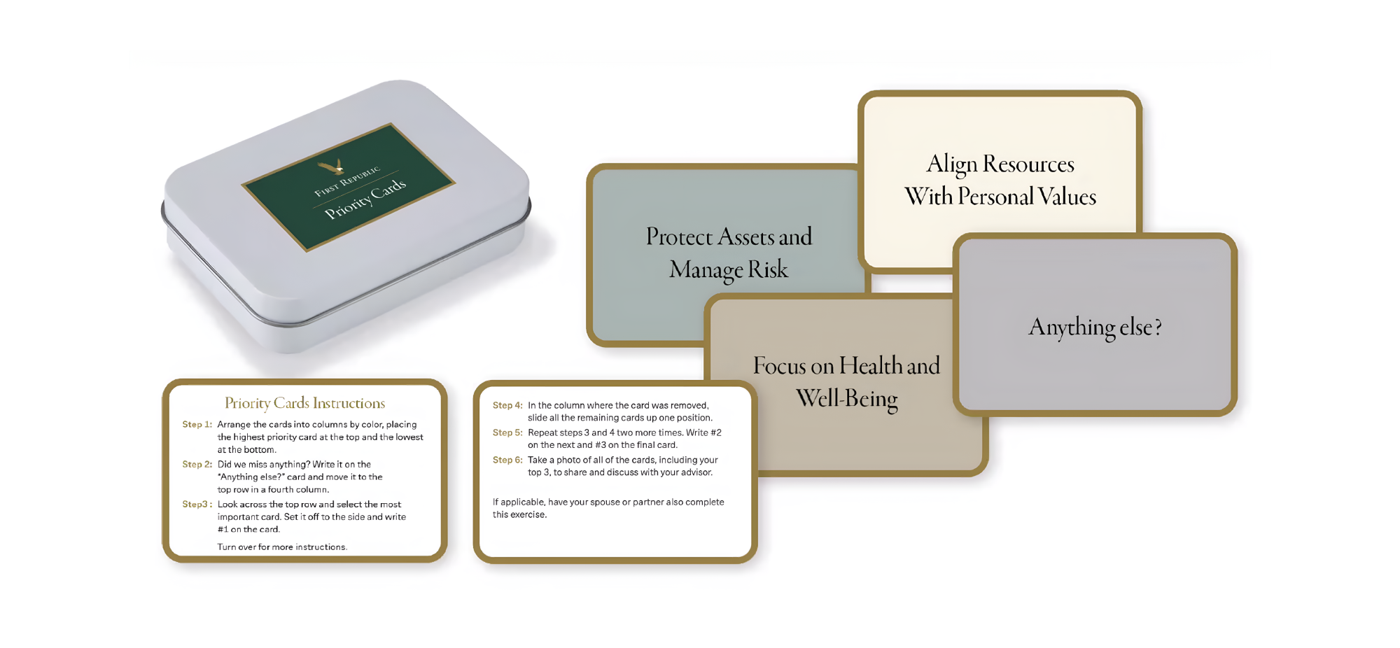
After
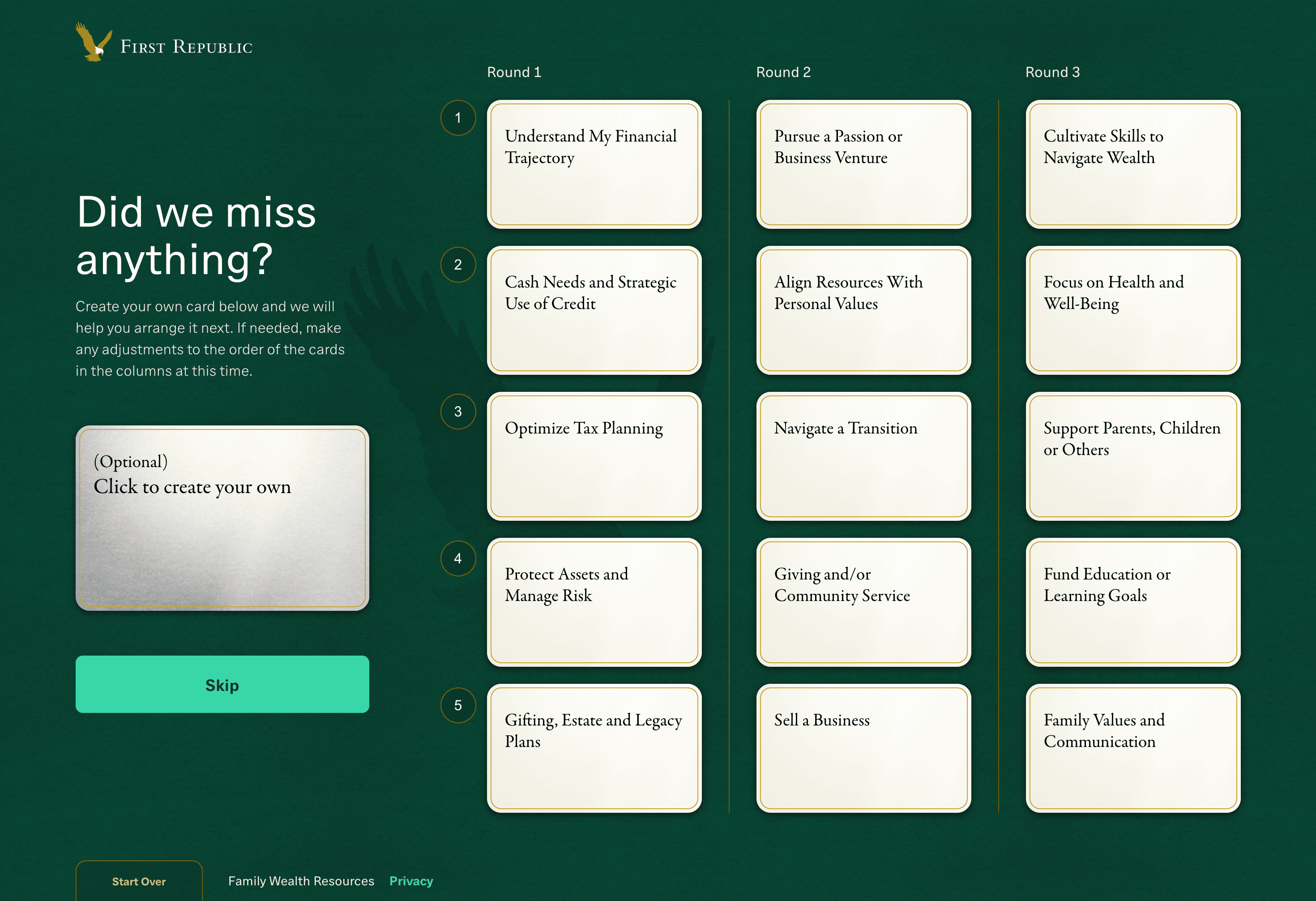
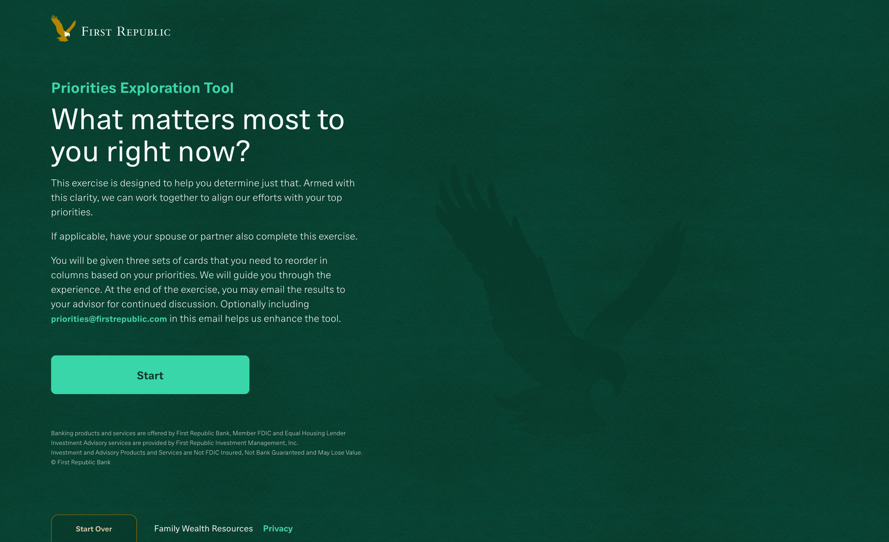
Brand Alignment
The overall visual design incorporates a lot of green,
as it’s First Republic's brand color. A dark green
textured background with an eagle watermark adds
realism and brand alignment. Neon green is used
for primary buttons.
The overall visual design incorporates a lot of green,
as it’s First Republic's brand color. A dark green
textured background with an eagle watermark adds
realism and brand alignment. Neon green is used
for primary buttons.
as it’s First Republic's brand color. A dark green
textured background with an eagle watermark adds
realism and brand alignment. Neon green is used
for primary buttons.